September Free Motion Quilting Challenge
Here's my September challenge sample (at last!).
This month, SewCalGal gave us Paula Reid who gave us lots of great hints for how to manage big quilts in a little machine. It's probably about time to give that a try and use some of these FMQ patterns I've been learning!
Her practice lesson was about using stencils in FMQ, so she and The Stencil Company allowed us to use this "Fancy Feather" wreath design (as a PDF). Since I don't have any transfer papers, I went back to Don Linn's Tutorial and used his method of transferring a design to fabric.
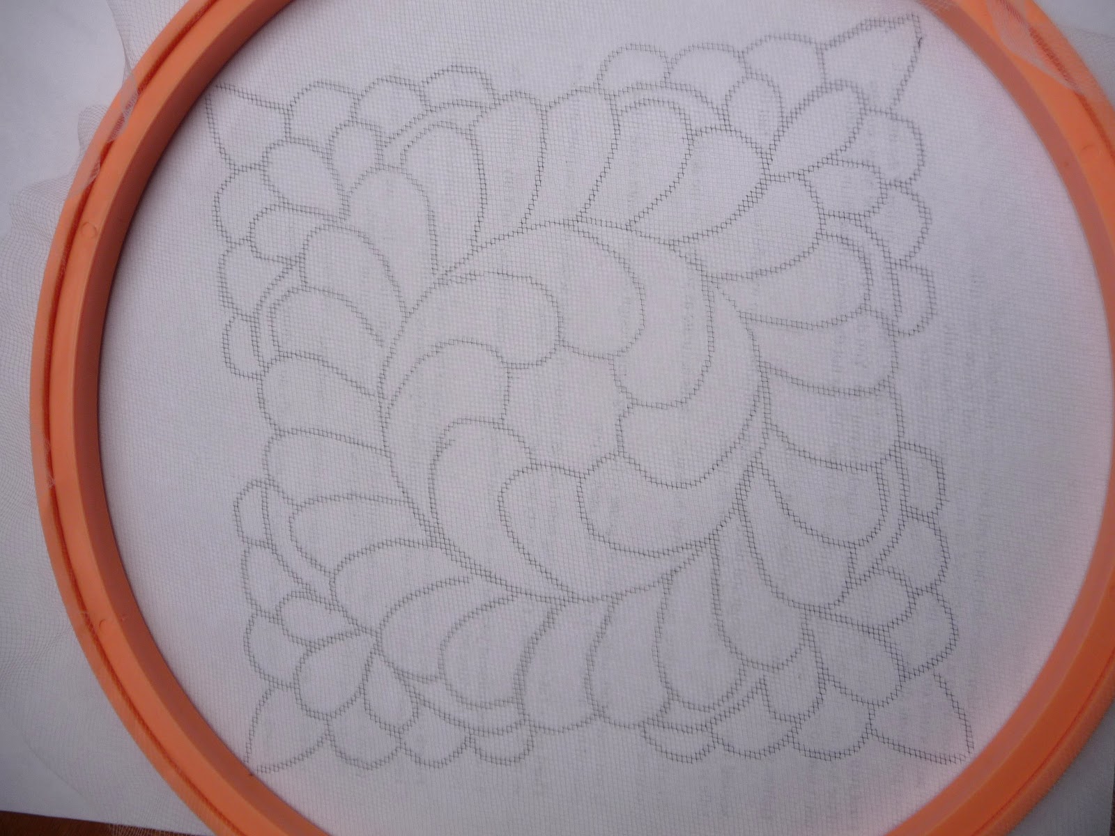
First to trace the design on tulle with a permanent marker,
and here's what you see after the xerox copy is removed
Then after heat setting the marker, put the tulle stencil on the fabric and go over the design with washable pen
and here's a closeup where I've moved the stencil slightly so you can see the tracing.
Then you stitch! Using plain old Mettler Silk Finish Cotton 50 weight thread here - since there would be some traveling stitches (going back over lines) I went to a lighter weight to reduce bulk in those areas.
And I've set the design on point and added a background grid (from Cindy Needham's tutorial). Though if I did it again, I would either put an echo or a straight line border around the stencil design first (meant to do that, planned to do that, drat those best laid plans anyhow).
Front above (white) and back below (black)
I deliberately did not match my top thread and bobbin thread, since I wanted to see how I was doing as far as thread tension, and noticed an interesting phenomena - in one direction my stitches look fine, but in the very next row (opposite direction) I get bobbin dots on the top! What's that about?
Well,
clearly it's to re-emphasize that it's best to match the colors in top
and bobbin since there's no tension adjustment to fix dots on both
sides! (and yes, it is the opposite rows that have dots on the other side)
So here it is after washing out the blue lines (post washing back is at the top of the page).
If you look closely there's lots of funky irregularities, but it looks just fine from a distance.
I think that means not to stress so much when irregularities happen on a "real" quilt and just go for it and have fun (especially if the threads are chosen to match instead of contrast) (and you're not hoping to win a prize or something).
Still having fun, learning lots, and feeling more confident. Thanks SewCalGal!


You did a good job on the challenge. I like your background, even without the outline you intended.
ReplyDeleteYou were brave to use a different bobbin color on a light top, but it turned out well. I have still never used different colors in my bobbin--I am such a wimp! : )
Thanks Janet. I may have been brave (foolhardy?), and though it looks fine from a distance, I still would not recommend 2 different colors - if you look closely the other side color does dot over frequently.
Delete